Visualization_With_Seaborn
Visualization_With_Seaborn
Visualization_With_Seaborn
1
2
3
4
5
6
import matplotlib.pyplot as plt
%matplotlib
inline
import seaborn as sns
import numpy as np
import pandas as pd
1
sns.set()  # 차트 스타일을 설정하는 seaborn 메서드
Exploring Seaborn Plots
seaborn의 주 목적은 통계 데이터 탐색과 몇 가지 통계 모델 적합에 유용한 다양한 플롯 유형을 생성할 수 있도록 고차원 명령어를 제공하는 것
Histograms, KDE, and densities
1
2
3
4
5
6
7
8
9
data = np.random.multivariate_normal([0, 0], [[5, 2], [2, 2]], size=2000)
data = pd.DataFrame(data, columns=['x', 'y'])
# 데이터 클리닝: 무한 값 대체
data.replace([np.inf, -np.inf], np.nan, inplace=True)
data.dropna(inplace=True)
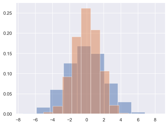
# 분포를 시각화하기 위한 히스토그램
for col in 'xy':
plt.hist(data[col], density=True, alpha=0.5)
1
2
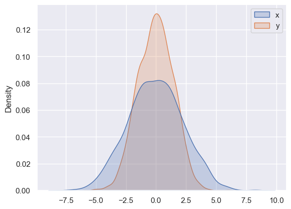
# 분포 시각화를 위한 커널 밀도 추정치
sns.kdeplot(data=data, fill=True);
1
2
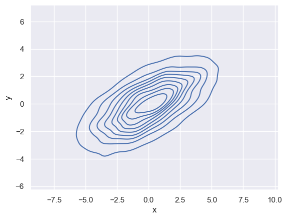
# 2차원 커널 밀도 그래프
sns.kdeplot(data, x='x', y='y');
1
2
3
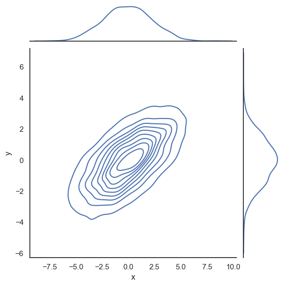
# 결합분포와 한계분포
with sns.axes_style('white'):
sns.jointplot(data=data, x="x", y="y", kind='kde');
1
2
3
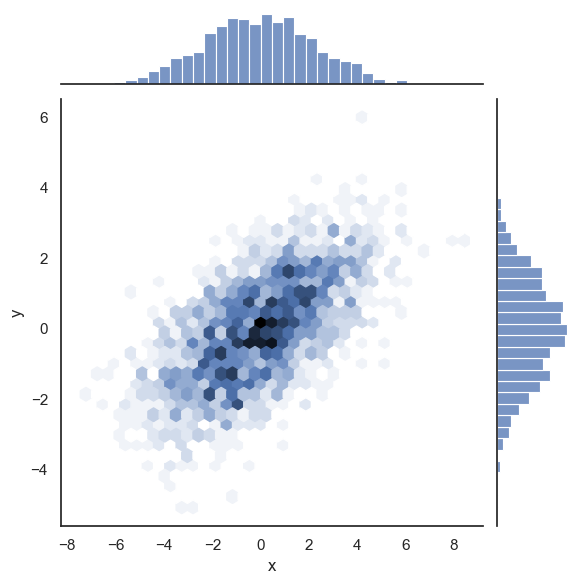
# 육각형 기반
with sns.axes_style('white'):
sns.jointplot(data=data, x="x", y="y", kind='hex');
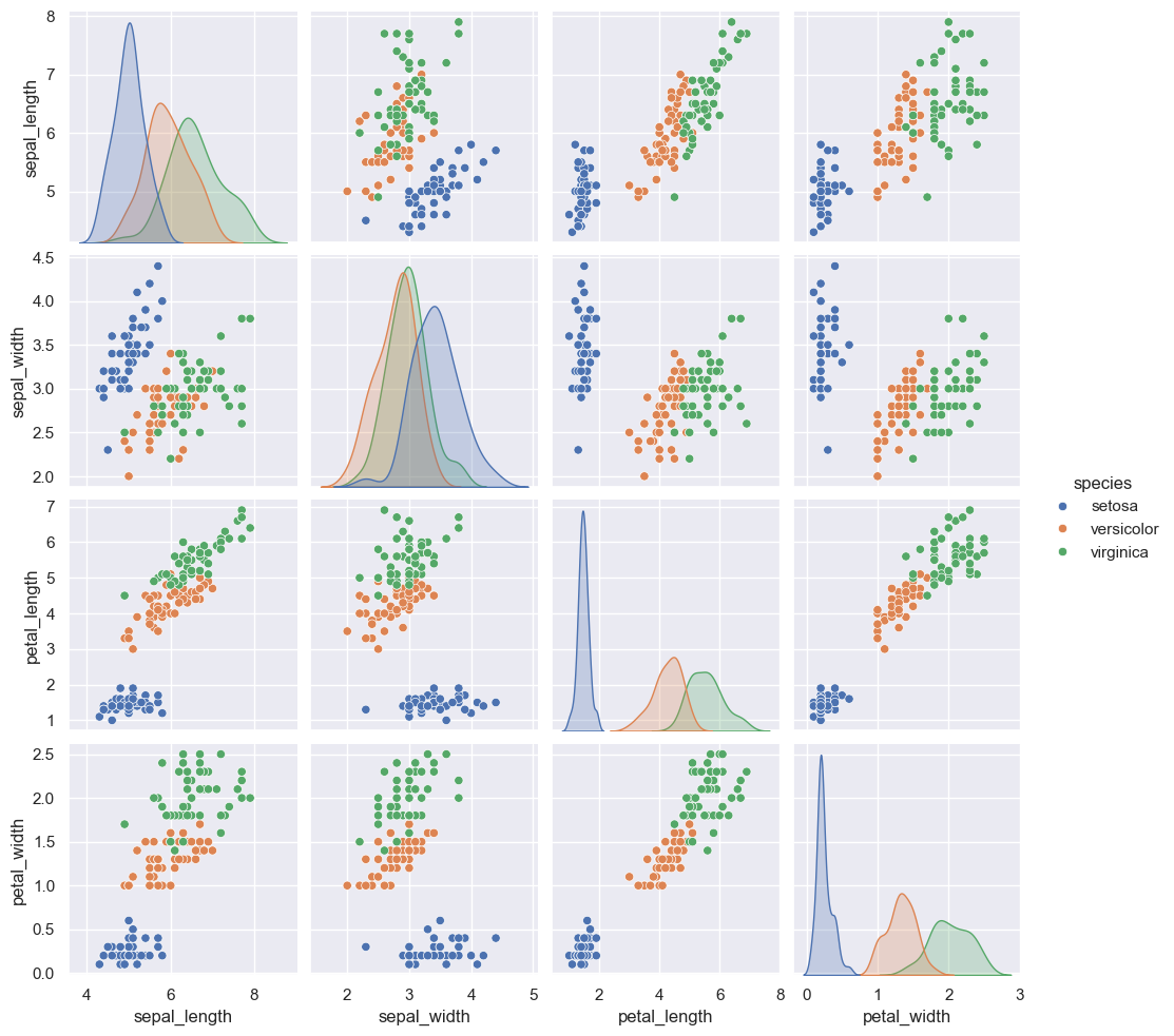
Pair plots
1
2
iris = sns.load_dataset("iris")
iris.head()
| sepal_length | sepal_width | petal_length | petal_width | species | |
|---|---|---|---|---|---|
| 0 | 5.1 | 3.5 | 1.4 | 0.2 | setosa |
| 1 | 4.9 | 3.0 | 1.4 | 0.2 | setosa |
| 2 | 4.7 | 3.2 | 1.3 | 0.2 | setosa |
| 3 | 4.6 | 3.1 | 1.5 | 0.2 | setosa |
| 4 | 5.0 | 3.6 | 1.4 | 0.2 | setosa |
1
2
# 표번 사이 다차원 관계 시각화
sns.pairplot(iris, hue='species', height=2.5);
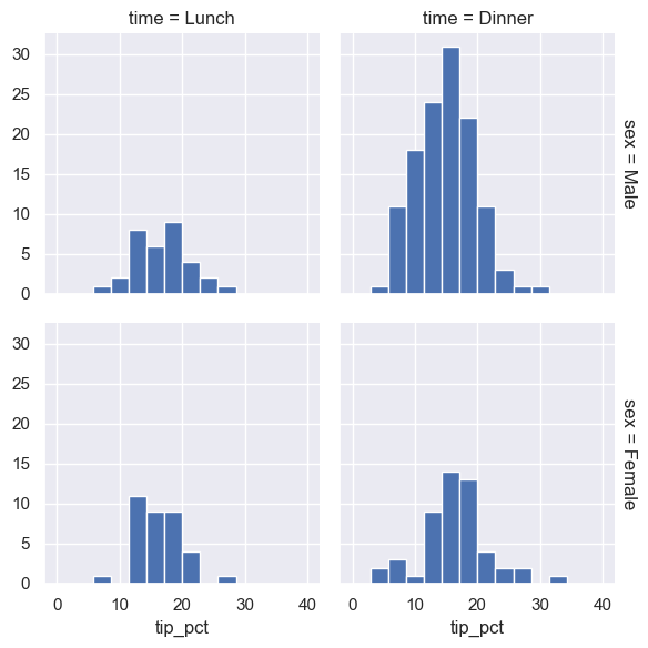
Faceted histograms
1
2
tips = sns.load_dataset('tips')
tips.head()
| total_bill | tip | sex | smoker | day | time | size | |
|---|---|---|---|---|---|---|---|
| 0 | 16.99 | 1.01 | Female | No | Sun | Dinner | 2 |
| 1 | 10.34 | 1.66 | Male | No | Sun | Dinner | 3 |
| 2 | 21.01 | 3.50 | Male | No | Sun | Dinner | 3 |
| 3 | 23.68 | 3.31 | Male | No | Sun | Dinner | 2 |
| 4 | 24.59 | 3.61 | Female | No | Sun | Dinner | 4 |
1
2
3
4
tips['tip_pct'] = 100 * tips['tip'] / tips['total_bill']

grid = sns.FacetGrid(tips, row="sex", col="time", margin_titles=True)
grid.map(plt.hist, "tip_pct", bins=np.linspace(0, 40, 15));
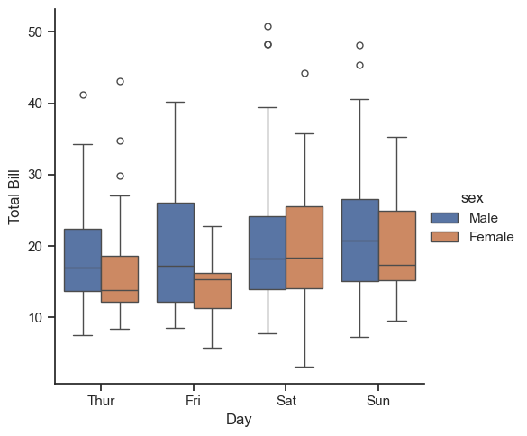
범주형 플롯 catplots
1
2
3
with sns.axes_style(style='ticks'):
    g = sns.catplot(x="day", y="total_bill", hue="sex", data=tips, kind="box")
    g.set_axis_labels("Day", "Total Bill");
Joint distributions
1
2
3
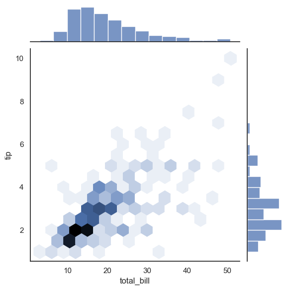
# 결합 분포 플롯
with sns.axes_style('white'):
sns.jointplot(x="total_bill", y="tip", data=tips, kind='hex')
1
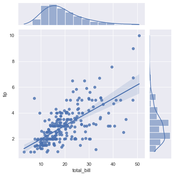
2
# 자동 커널 밀도 추정과 회귀 분석 수행
sns.jointplot(x="total_bill", y="tip", data=tips, kind='reg');
Bar plots
1
2
planets = sns.load_dataset('planets')
planets.head()
| method | number | orbital_period | mass | distance | year | |
|---|---|---|---|---|---|---|
| 0 | Radial Velocity | 1 | 269.300 | 7.10 | 77.40 | 2006 |
| 1 | Radial Velocity | 1 | 874.774 | 2.21 | 56.95 | 2008 |
| 2 | Radial Velocity | 1 | 763.000 | 2.60 | 19.84 | 2011 |
| 3 | Radial Velocity | 1 | 326.030 | 19.40 | 110.62 | 2007 |
| 4 | Radial Velocity | 1 | 516.220 | 10.50 | 119.47 | 2009 |
1
2
3
4
5
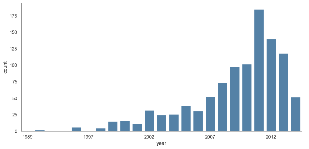
# 요인 플롯의 특별한 경우로 사용된 히스토그램
with sns.axes_style('white'):
g = sns.catplot(x="year", data=planets, aspect=2,
kind="count", color='steelblue')
g.set_xticklabels(step=5)
1
2
3
4
5
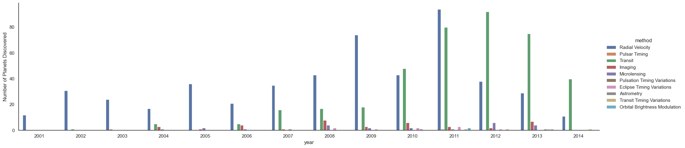
# 연도 및 유형별로 발견된 행성 수
with sns.axes_style('white'):
g = sns.catplot(x="year", data=planets, aspect=4.0, kind='count',
hue='method', order=range(2001, 2015))
g.set_ylabels('Number of Planets Discovered')
Example: Exploring Marathon Finishing Times
1
2
data = pd.read_csv('./marathon-data.csv')
data.head()
| age | gender | split | final | |
|---|---|---|---|---|
| 0 | 33 | M | 01:05:38 | 02:08:51 |
| 1 | 32 | M | 01:06:26 | 02:09:28 |
| 2 | 31 | M | 01:06:49 | 02:10:42 |
| 3 | 38 | M | 01:06:16 | 02:13:45 |
| 4 | 31 | M | 01:06:32 | 02:13:59 |
1
2
# 기본적으로 Pandas는 시간 열을 파이썬 문자열로 적재
data.dtypes
1
2
3
4
5
age        int64
gender    object
split     object
final     object
dtype: object
1
2
3
4
5
6
7
8
9
10
11
import datetime


def convert_time(s):
    h, m, s = map(int, s.split(':'))
    return datetime.timedelta(hours=h, minutes=m, seconds=s)


data = pd.read_csv('./marathon-data.csv',
                   converters={'split': convert_time, 'final': convert_time})
data.head()
| age | gender | split | final | |
|---|---|---|---|---|
| 0 | 33 | M | 0 days 01:05:38 | 0 days 02:08:51 |
| 1 | 32 | M | 0 days 01:06:26 | 0 days 02:09:28 |
| 2 | 31 | M | 0 days 01:06:49 | 0 days 02:10:42 |
| 3 | 38 | M | 0 days 01:06:16 | 0 days 02:13:45 |
| 4 | 31 | M | 0 days 01:06:32 | 0 days 02:13:59 |
1
data.dtypes
1
2
3
4
5
age                 int64
gender             object
split     timedelta64[ns]
final     timedelta64[ns]
dtype: object
1
2
3
4
# Seaborn 플로팅을 목적으로 시간을 초로 제공하는 열 추가
data['split_sec'] = data['split'].dt.total_seconds()
data['final_sec'] = data['final'].dt.total_seconds()
data.head()
| age | gender | split | final | split_sec | final_sec | |
|---|---|---|---|---|---|---|
| 0 | 33 | M | 0 days 01:05:38 | 0 days 02:08:51 | 3938.0 | 7731.0 |
| 1 | 32 | M | 0 days 01:06:26 | 0 days 02:09:28 | 3986.0 | 7768.0 |
| 2 | 31 | M | 0 days 01:06:49 | 0 days 02:10:42 | 4009.0 | 7842.0 |
| 3 | 38 | M | 0 days 01:06:16 | 0 days 02:13:45 | 3976.0 | 8025.0 |
| 4 | 31 | M | 0 days 01:06:32 | 0 days 02:13:59 | 3992.0 | 8039.0 |
1
2
3
4
5
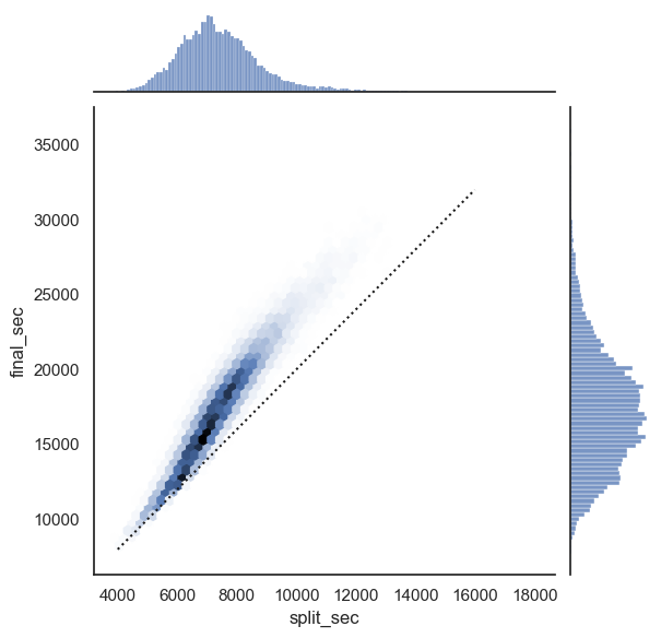
# 데이터 확인을 위한 플로팅
with sns.axes_style('white'):
g = sns.jointplot(x="split_sec", y="final_sec", data=data, kind='hex')
g.ax_joint.plot(np.linspace(4000, 16000),
np.linspace(8000, 32000), ':k')
1
2
3
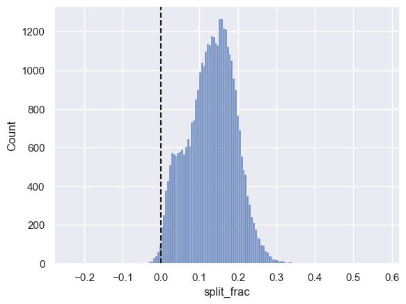
# 주자가 네거티브 스플릿 주자인지 포지티브 스플릿 주자인지 정도를 측정하는 열
data['split_frac'] = 1 - 2 * data['split_sec'] / data['final_sec']
data.head()
| age | gender | split | final | split_sec | final_sec | split_frac | |
|---|---|---|---|---|---|---|---|
| 0 | 33 | M | 0 days 01:05:38 | 0 days 02:08:51 | 3938.0 | 7731.0 | -0.018756 |
| 1 | 32 | M | 0 days 01:06:26 | 0 days 02:09:28 | 3986.0 | 7768.0 | -0.026262 |
| 2 | 31 | M | 0 days 01:06:49 | 0 days 02:10:42 | 4009.0 | 7842.0 | -0.022443 |
| 3 | 38 | M | 0 days 01:06:16 | 0 days 02:13:45 | 3976.0 | 8025.0 | 0.009097 |
| 4 | 31 | M | 0 days 01:06:32 | 0 days 02:13:59 | 3992.0 | 8039.0 | 0.006842 |
1
2
3
# 만든 열을 통한 분포도
sns.histplot(data['split_frac'], kde=False);
plt.axvline(0, color="k", linestyle="--");
1
2
# 네거티브 스플릿 수
sum(data.split_frac < 0)
1
251
1
2
3
4
5
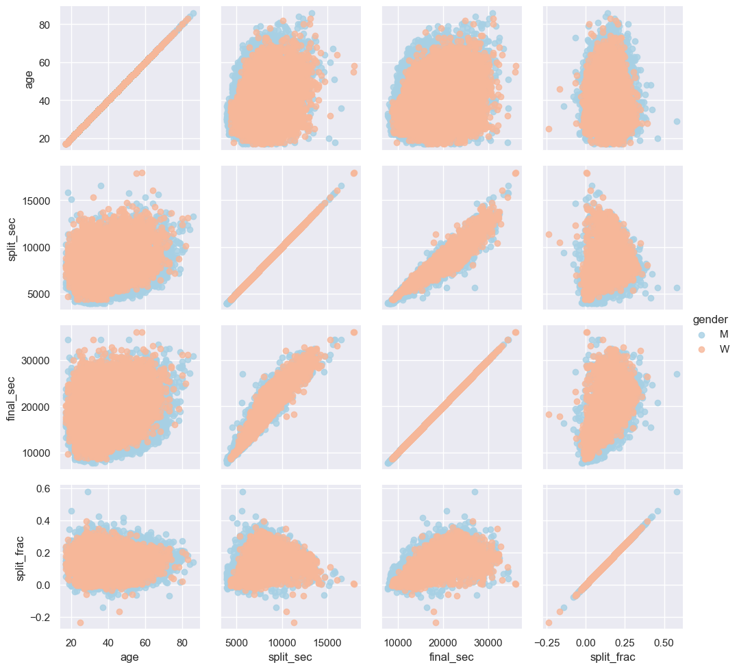
# 스플릿 정도와 다른 변수들 사이에 상관관계 확인
g = sns.PairGrid(data, vars=['age', 'split_sec', 'final_sec', 'split_frac'],
hue='gender', palette='RdBu_r')
g.map(plt.scatter, alpha=0.8)
g.add_legend();
1
2
3
4
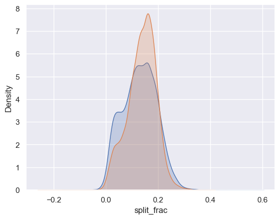
# 남성과 여성 사이 차이
sns.kdeplot(data.split_frac[data.gender == 'M'], label='men', fill=True)
sns.kdeplot(data.split_frac[data.gender == 'W'], label='women', fill=True)
plt.xlabel('split_frac');
1
2
3
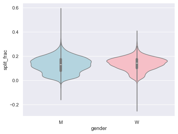
# 나이의 함수로 분포 비교
sns.violinplot(x="gender", y="split_frac", data=data, hue="gender",
palette=["lightblue", "lightpink"], legend=False);
1
2
data['age_dec'] = data.age.map(lambda age: 10 * (age // 10))
data.head()
| age | gender | split | final | split_sec | final_sec | split_frac | age_dec | |
|---|---|---|---|---|---|---|---|---|
| 0 | 33 | M | 0 days 01:05:38 | 0 days 02:08:51 | 3938.0 | 7731.0 | -0.018756 | 30 |
| 1 | 32 | M | 0 days 01:06:26 | 0 days 02:09:28 | 3986.0 | 7768.0 | -0.026262 | 30 |
| 2 | 31 | M | 0 days 01:06:49 | 0 days 02:10:42 | 4009.0 | 7842.0 | -0.022443 | 30 |
| 3 | 38 | M | 0 days 01:06:16 | 0 days 02:13:45 | 3976.0 | 8025.0 | 0.009097 | 30 |
| 4 | 31 | M | 0 days 01:06:32 | 0 days 02:13:59 | 3992.0 | 8039.0 | 0.006842 | 30 |
1
2
3
4
5
6
7
8
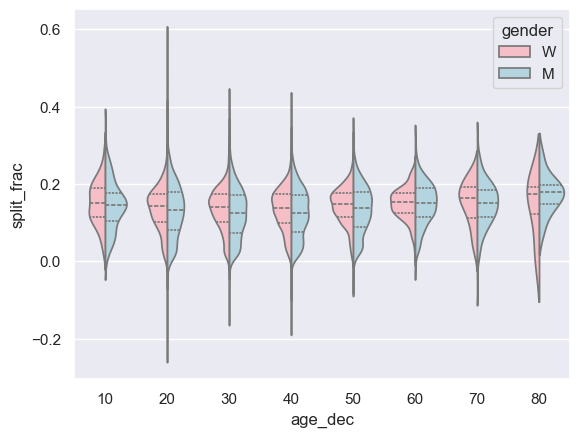
# 나이 함수로 바이올린 플롯 비교
men = (data.gender == 'M')
women = (data.gender == 'W')
with sns.axes_style(style=None):
sns.violinplot(x="age_dec", y="split_frac", hue="gender", data=data,
split=True, inner="quartile",
palette=["lightpink", "lightblue"]);
1
2
# 데이터 표본이 작아 80대 이상 여성의 능력치 이상
(data.age > 80).sum()
1
7
1
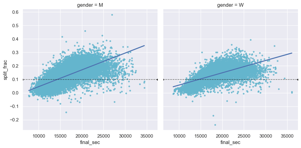
2
3
4
# 데이터에 선형 회귀 모형 자동 적합
g = sns.lmplot(x='final_sec', y='split_frac', col='gender', data=data,
markers=".", scatter_kws=dict(color='c'))
g.map(plt.axhline, y=0.1, color="k", ls=":");
이 기사는 저작권자의 CC BY-NC 4.0 라이센스를 따릅니다.