Text_And_Annotation
Text_And_Annotation
Text_And_Annotation
1
2
3
4
5
6
7
8
%matplotlib
inline
import matplotlib.pyplot as plt
import matplotlib as mpl

plt.style.use('seaborn-v0_8-whitegrid')
import numpy as np
import pandas as pd
Example: Effect of Holidays on US Births
1
2
3
4
5
6
7
8
9
10
11
12
13
14
15
births = pd.read_csv('./births.csv')

quartiles = np.percentile(births['births'], [25, 50, 75])
mu, sig = quartiles[1], 0.74 * (quartiles[2] - quartiles[0])
births = births.query('(births > @mu - 5 * @sig) & (births < @mu + 5 * @sig)')

births['day'] = births['day'].astype(int)

births.index = pd.to_datetime(10000 * births.year +
                              100 * births.month +
                              births.day, format='%Y%m%d')
births_by_date = births.pivot_table('births',
                                    [births.index.month, births.index.day])
births_by_date.index = [pd.Timestamp(2012, month, day)
                        for (month, day) in births_by_date.index]
1
2
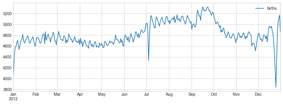
fig, ax = plt.subplots(figsize=(12, 4))
births_by_date.plot(ax=ax);
1
2
3
4
5
6
7
8
9
10
11
12
13
14
15
16
17
18
19
20
21
22
23
24
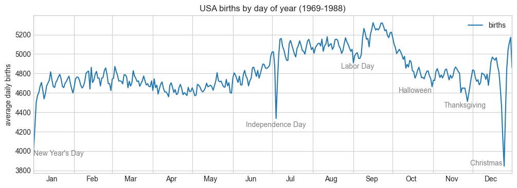
fig, ax = plt.subplots(figsize=(12, 4))
births_by_date.plot(ax=ax)
# 플롯에 레이블 추가 Add labels to the plot
style = dict(size=10, color='gray')
# 직접 주석 달기
ax.text('2012-1-1', 3950, "New Year's Day", **style)
ax.text('2012-7-4', 4250, "Independence Day", ha='center', **style)
ax.text('2012-9-4', 4850, "Labor Day", ha='center', **style)
ax.text('2012-10-31', 4600, "Halloween", ha='right', **style)
ax.text('2012-11-25', 4450, "Thanksgiving", ha='center', **style)
ax.text('2012-12-25', 3850, "Christmas ", ha='right', **style)
# 축에 레이블 추가 Label the axes
ax.set(title='USA births by day of year (1969-1988)',
ylabel='average daily births')
# 중앙 정렬한 월 레이블로 x축의 포맷 지정
# Format the x axis with centered month labels
ax.xaxis.set_major_locator(mpl.dates.MonthLocator())
ax.xaxis.set_minor_locator(mpl.dates.MonthLocator(bymonthday=15))
ax.xaxis.set_major_formatter(plt.NullFormatter())
ax.xaxis.set_minor_formatter(mpl.dates.DateFormatter('%h'));
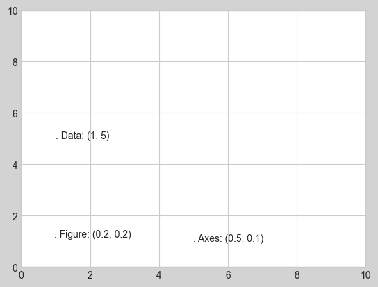
Transforms and Text Position
ax.transData : 데이터 좌표와 관련된 변환
ax.transAxes : 축과 관련된 변환(축 차원의 단위로)
fig.transFigure : 그림과 관련된 변환(그림 차원의 단위로)
1
2
3
4
5
6
7
fig, ax = plt.subplots(facecolor='lightgray')
ax.axis([0, 10, 0, 10])

# transform=ax.transData is the default, but we'll specify it anyway
ax.text(1, 5, ". Data: (1, 5)", transform=ax.transData)
ax.text(0.5, 0.1, ". Axes: (0.5, 0.1)", transform=ax.transAxes)
ax.text(0.2, 0.2, ". Figure: (0.2, 0.2)", transform=fig.transFigure);
1
2
3
4
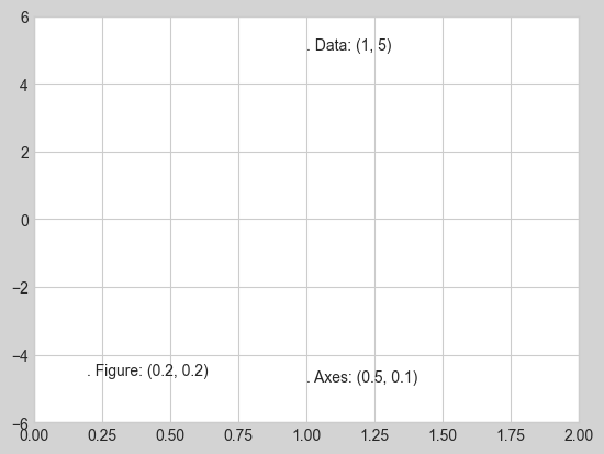
# 축 한곗값을 바꾸면 transData 좌표만 영향
ax.set_xlim(0, 2)
ax.set_ylim(-6, 6)
fig
Arrows and Annotation
1
2
3
4
5
6
7
8
9
10
11
12
13
14
15
%matplotlib
inline
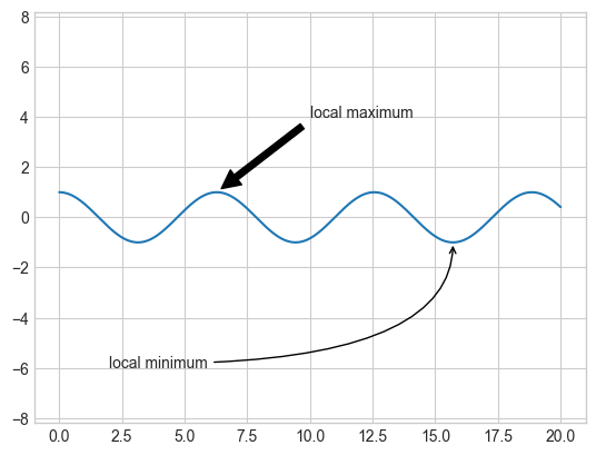
fig, ax = plt.subplots()
x = np.linspace(0, 20, 1000)
ax.plot(x, np.cos(x))
ax.axis('equal')
ax.annotate('local maximum', xy=(6.28, 1), xytext=(10, 4),
arrowprops=dict(facecolor='black', shrink=0.05))
ax.annotate('local minimum', xy=(5 * np.pi, -1), xytext=(2, -6),
arrowprops=dict(arrowstyle="->",
connectionstyle="angle3,angleA=0,angleB=-90"));
1
2
3
4
5
6
7
8
9
10
11
12
13
14
15
16
17
18
19
20
21
22
23
24
25
26
27
28
29
30
31
32
33
34
35
36
37
38
39
40
41
42
43
44
45
46
47
48
49
50
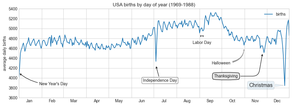
fig, ax = plt.subplots(figsize=(12, 4))
births_by_date.plot(ax=ax)
# 플롯에 레이블 추가 Add labels to the plot
ax.annotate("New Year's Day", xy=('2012-1-1', 4100), xycoords='data',
xytext=(50, -30), textcoords='offset points',
arrowprops=dict(arrowstyle="->",
connectionstyle="arc3,rad=-0.2"))
ax.annotate("Independence Day", xy=('2012-7-4', 4250), xycoords='data',
bbox=dict(boxstyle="round", fc="none", ec="gray"),
xytext=(10, -40), textcoords='offset points', ha='center',
arrowprops=dict(arrowstyle="->"))
ax.annotate('Labor Day', xy=('2012-9-4', 4850), xycoords='data', ha='center',
xytext=(0, -20), textcoords='offset points')
ax.annotate('', xy=('2012-9-1', 4850), xytext=('2012-9-7', 4850),
xycoords='data', textcoords='data',
arrowprops={'arrowstyle': '|-|,widthA=0.2,widthB=0.2', })
ax.annotate('Halloween', xy=('2012-10-31', 4600), xycoords='data',
xytext=(-80, -40), textcoords='offset points',
arrowprops=dict(arrowstyle="fancy",
fc="0.6", ec="none",
connectionstyle="angle3,angleA=0,angleB=-90"))
ax.annotate('Thanksgiving', xy=('2012-11-25', 4500), xycoords='data',
xytext=(-120, -60), textcoords='offset points',
bbox=dict(boxstyle="round4,pad=.5", fc="0.9"),
arrowprops=dict(arrowstyle="->",
connectionstyle="angle,angleA=0,angleB=80,rad=20"))
ax.annotate('Christmas', xy=('2012-12-25', 3850), xycoords='data',
xytext=(-30, 0), textcoords='offset points',
size=13, ha='right', va="center",
bbox=dict(boxstyle="round", alpha=0.1),
arrowprops=dict(arrowstyle="wedge,tail_width=0.5", alpha=0.1));
# 축에 레이블 달기 Label the axes
ax.set(title='USA births by day of year (1969-1988)',
ylabel='average daily births')
# x축의 포맷을 중앙 정렬된 월 레이블로 지정
# Format the x axis with centered month labels
ax.xaxis.set_major_locator(mpl.dates.MonthLocator())
ax.xaxis.set_minor_locator(mpl.dates.MonthLocator(bymonthday=15))
ax.xaxis.set_major_formatter(plt.NullFormatter())
ax.xaxis.set_minor_formatter(mpl.dates.DateFormatter('%h'));
ax.set_ylim(3600, 5400);
이 기사는 저작권자의 CC BY-NC 4.0 라이센스를 따릅니다.