Customizing_Legends
Customizing_Legends
Customizing Plot Legends
1
2
3
4
5
6
import matplotlib.pyplot as plt

plt.style.use('classic')
%matplotlib
inline
import numpy as np
1
2
3
4
5
6
7
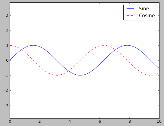
# 기본 플롯 범례
x = np.linspace(0, 10, 1000)
fig, ax = plt.subplots()
ax.plot(x, np.sin(x), '-b', label='Sine')
ax.plot(x, np.cos(x), '--r', label='Cosine')
ax.axis('equal')
leg = ax.legend();
1
2
3
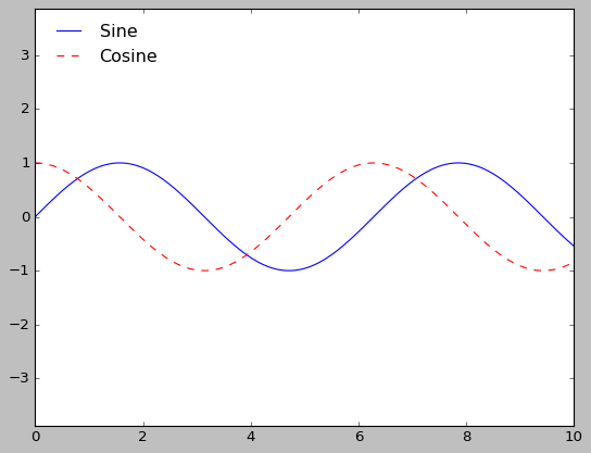
# 테두리 제거 위치 지정
ax.legend(loc='upper left', frameon=False)
fig
1
2
3
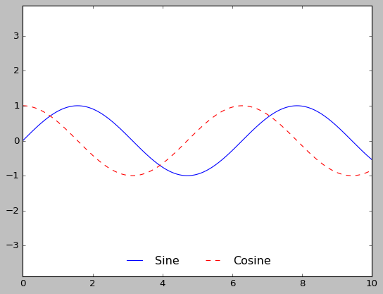
# 열 개수 지정
ax.legend(frameon=False, loc='lower center', ncol=2)
fig
1
2
3
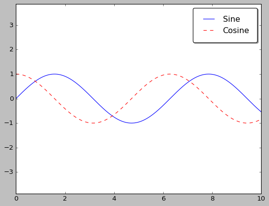
# 둥근 모서리 박스 테두리
ax.legend(fancybox=True, framealpha=1, shadow=True, borderpad=1)
fig
Choosing Elements for the Legend
1
2
3
4
5
6
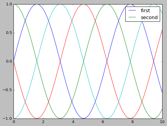
# 범례 요소의 맞춤 설정
y = np.sin(x[:, np.newaxis] + np.pi * np.arange(0, 2, 0.5))
lines = plt.plot(x, y)
# lines is a list of plt.Line2D instances
plt.legend(lines[:2], ['first', 'second']);

1
2
3
4
5
# 플롯 요소에 레이블 적용
plt.plot(x, y[:, 0], label='first')
plt.plot(x, y[:, 1], label='second')
plt.plot(x, y[:, 2:])
plt.legend(framealpha=1, frameon=True);
Legend for Size of Points
1
2
3
4
5
6
7
8
9
10
11
12
13
14
15
16
17
18
19
20
21
22
23
24
25
26
27
28
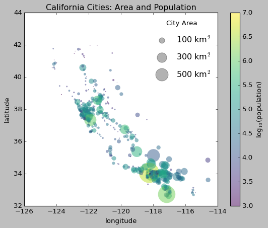
import pandas as pd
cities = pd.read_csv('./california_cities.csv')
# 관심 데이터 추출 Extract the data we're interested in
lat, lon = cities['latd'], cities['longd']
population, area = cities['population_total'], cities['area_total_km2']
# 레이블은 없지만 크기와 색상을 사용해 점을 뿌림
# Scatter the points, using size and color but no label
plt.scatter(lon, lat, label=None,
c=np.log10(population), cmap='viridis',
s=area, linewidth=0, alpha=0.5)
plt.gca().set_aspect('equal')
plt.xlabel('longitude')
plt.ylabel('latitude')
plt.colorbar(label='log$_{10}$(population)')
plt.clim(3, 7)
# 범례 생성 Here we create a legend:
# 원하는 크기와 레이블로 빈 리스트 플로팅
# we'll plot empty lists with the desired size and label
for area in [100, 300, 500]:
plt.scatter([], [], c='k', alpha=0.3, s=area,
label=str(area) + ' km$^2$')
plt.legend(scatterpoints=1, frameon=False, labelspacing=1, title='City Area')
plt.title('California Cities: Area and Population');
Multiple Legends
1
2
3
4
5
6
7
8
9
10
11
12
13
14
15
16
17
18
19
20
21
22
23
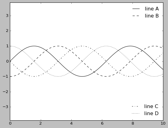
fig, ax = plt.subplots()
lines = []
styles = ['-', '--', '-.', ':']
x = np.linspace(0, 10, 1000)
for i in range(4):
lines += ax.plot(x, np.sin(x - i * np.pi / 2),
styles[i], color='black')
ax.axis('equal')
# 첫 번째 범례의 라인과 레이블을 지정
# specify the lines and labels of the first legend
ax.legend(lines[:2], ['line A', 'line B'],
loc='upper right', frameon=False)
# 두 번째 범례를 만들고 직접 아티스트를 추가
# Create the second legend and add the artist manually.
from matplotlib.legend import Legend
leg = Legend(ax, lines[2:], ['line C', 'line D'],
loc='lower right', frameon=False)
ax.add_artist(leg);
이 기사는 저작권자의 CC BY-NC 4.0 라이센스를 따릅니다.