Density_And_Contour_Plots
Density_And_Contour_Plots
Density_And_Contour_Plots
1
2
3
4
5
6
%matplotlib
inline
import matplotlib.pyplot as plt

plt.style.use('seaborn-v0_8-white')
import numpy as np
Visualizing a Three-Dimensional Function
1
2
def f(x, y):
    return np.sin(x) ** 10 + np.cos(10 + y * x) * np.cos(x)
1
2
3
4
5
x = np.linspace(0, 5, 50)
y = np.linspace(0, 5, 40)
# 1차원 배열로부터 2차원 그리드 생성
X, Y = np.meshgrid(x, y)
Z = f(X, Y)
1
2
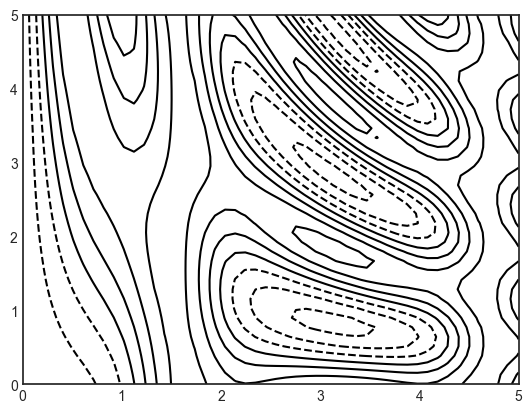
# 등고선으로 3차원 데이터 시각화
plt.contour(X, Y, Z, colors='black');
1
2
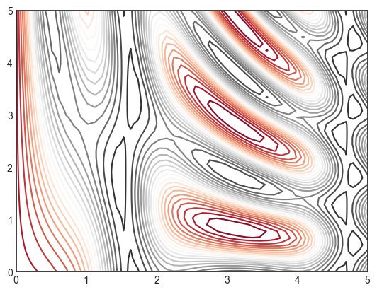
# 3차원 데이터 색을 입힌 등고선으로 시각화
plt.contour(X, Y, Z, 20, cmap='RdGy');
1
2
3
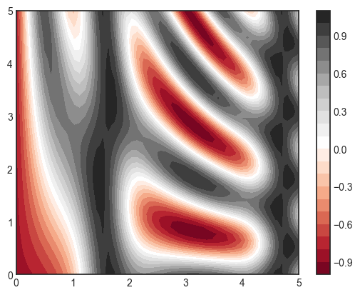
# 색을 채운 등고선으로 시각화
plt.contourf(X, Y, Z, 20, cmap='RdGy')
plt.colorbar();
1
2
3
4
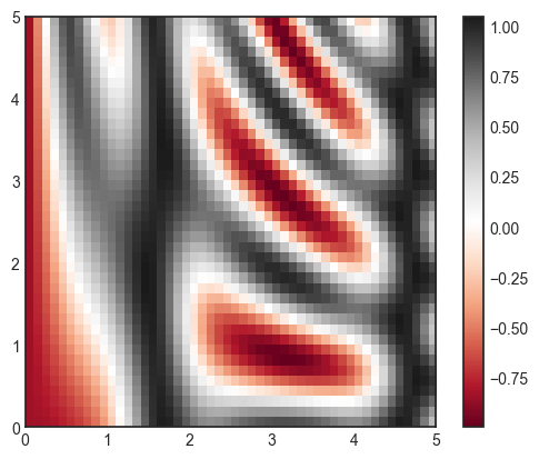
# 2차원 데이터 그리드를 이미지로 해석
plt.imshow(Z, extent=[0, 5, 0, 5], origin='lower',
cmap='RdGy', aspect='equal')
plt.colorbar()
1
<matplotlib.colorbar.Colorbar at 0x1ab1dc43aa0>
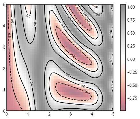
1
2
3
4
5
6
7
contours = plt.contour(X, Y, Z, 3, colors='black')
# 등고선 자체에 레이블 추가
plt.clabel(contours, inline=True, fontsize=8)

plt.imshow(Z, extent=[0, 5, 0, 5], origin='lower',
           cmap='RdGy', alpha=0.5)
plt.colorbar();
Histograms, Binnings, and Density
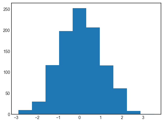
1
2
data = np.random.randn(1000)
plt.hist(data);
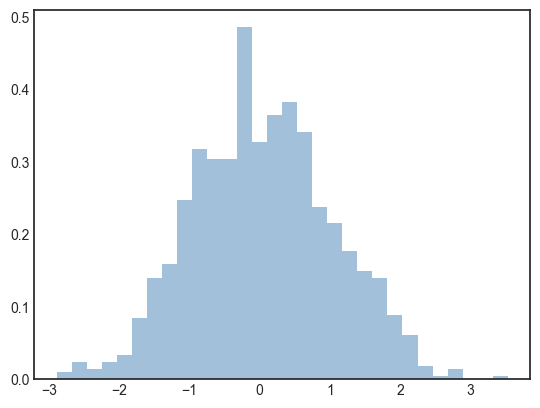
1
2
3
4
# 맞춤 설정 히스토그램
plt.hist(data, bins=30, density=True, alpha=0.5,
         histtype='stepfilled', color='steelblue',
         edgecolor='none');
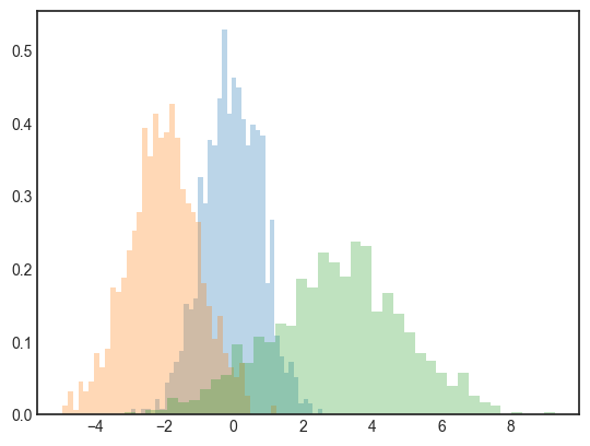
1
2
3
4
5
6
7
8
9
10
# 다중 히스토그램을 겹쳐서 표현한 플로팅
x1 = np.random.normal(0, 0.8, 1000)
x2 = np.random.normal(-2, 1, 1000)
x3 = np.random.normal(3, 2, 1000)

kwargs = dict(histtype='stepfilled', alpha=0.3, density=True, bins=40)

plt.hist(x1, **kwargs)
plt.hist(x2, **kwargs)
plt.hist(x3, **kwargs);
1
2
3
# 계산만 하고 특정 구간에 해당하는 점의 개수만 셀 때
counts, bin_edges = np.histogram(data, bins=5)
print(counts)
1
[ 40 315 458 178   9]
Two-Dimensional Histograms and Binnings
1
2
3
4
# 다변량 가우스 분포를 띄는 x와 y 배열 정의
mean = [0, 0]
cov = [[1, 1], [1, 2]]
x, y = np.random.multivariate_normal(mean, cov, 10000).T
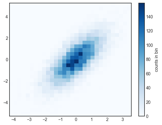
plt.hist2d: Two-dimensional histogram
1
2
3
4
# 2차원 히스토그램
plt.hist2d(x, y, bins=30, cmap='Blues')
cb = plt.colorbar()
cb.set_label('counts in bin')
1
counts, xedges, yedges = np.histogram2d(x, y, bins=30)
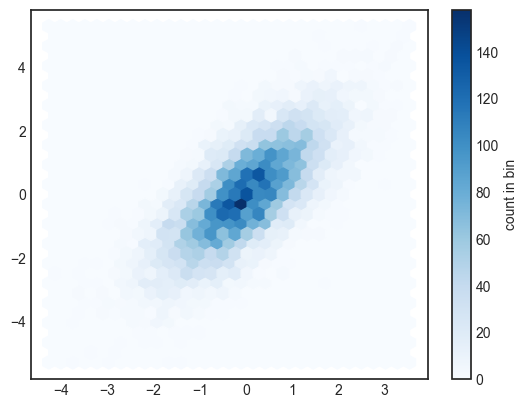
plt.hexbin: Hexagonal binnings
1
2
3
# 데이터세트를 육각형 그리드 내에 구간화
plt.hexbin(x, y, gridsize=30, cmap='Blues')
cb = plt.colorbar(label='count in bin')
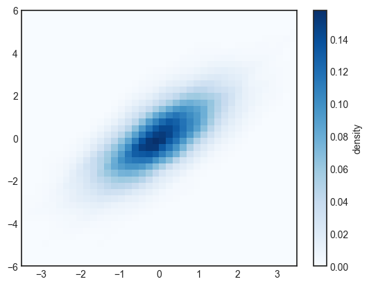
Kernel density estimation
1
2
3
4
5
6
7
8
9
10
11
12
13
14
15
16
17
18
19
20
# 분포의 커널 밀도 표현
from scipy.stats import gaussian_kde

# 배열 크기 맞추기 fit an array of size [Ndim, Nsamples]
data = np.vstack([x, y])
kde = gaussian_kde(data)

# 정규 그리드 평가 evaluate on a regular grid
xgrid = np.linspace(-3.5, 3.5, 40)
ygrid = np.linspace(-6, 6, 40)
Xgrid, Ygrid = np.meshgrid(xgrid, ygrid)
Z = kde.evaluate(np.vstack([Xgrid.ravel(), Ygrid.ravel()]))

# Plot the result as an image
plt.imshow(Z.reshape(Xgrid.shape),
           origin='lower', aspect='auto',
           extent=[-3.5, 3.5, -6, 6],
           cmap='Blues')
cb = plt.colorbar()
cb.set_label("density")
이 기사는 저작권자의 CC BY-NC 4.0 라이센스를 따릅니다.