Simple_Scatter_Plots
Simple_Scatter_Plots
Simple_Scatter_Plots
1
2
3
4
5
6
%matplotlib
inline
import matplotlib.pyplot as plt

plt.style.use('seaborn-v0_8-whitegrid')
import numpy as np
Scatter Plots with plt.plot
1
2
3
4
5
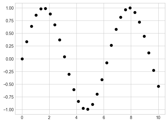
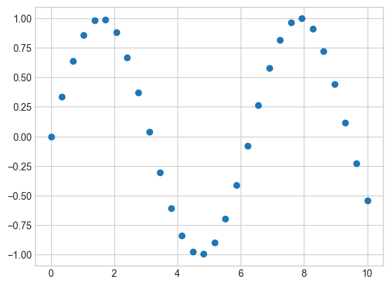
# 산점도
x = np.linspace(0, 10, 30)
y = np.sin(x)
plt.plot(x, y, 'o', color='black');
1
2
3
4
5
6
7
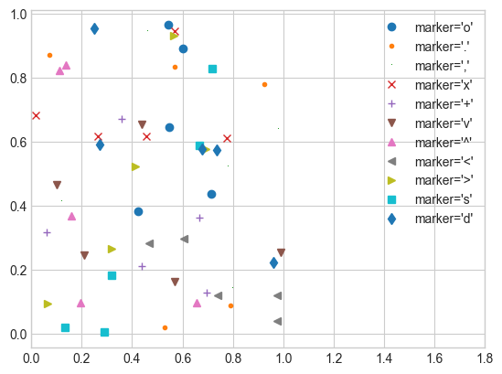
# 점의 형태
rng = np.random.RandomState(0)
for marker in ['o', '.', ',', 'x', '+', 'v', '^', '<', '>', 's', 'd']:
plt.plot(rng.rand(5), rng.rand(5), marker,
label="marker='{0}'".format(marker))
plt.legend(numpoints=1)
plt.xlim(0, 1.8);
1
2
3
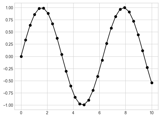
# 선과 점 표시를 결합
# 선(-), 원 표시 기호(o), 검정색(k)
plt.plot(x, y, '-ok');
1
2
3
4
5
6
7
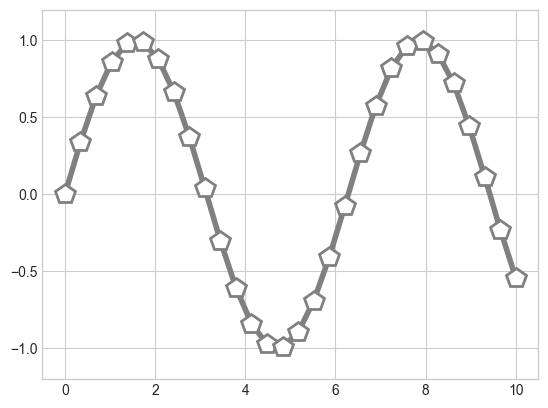
# 선과 점 맞춤 설정
plt.plot(x, y, '-p', color='gray',
markersize=15, linewidth=4,
markerfacecolor='white',
markeredgecolor='gray',
markeredgewidth=2)
plt.ylim(-1.2, 1.2);
Scatter Plots with plt.scatter
1
plt.scatter(x, y, marker='o');
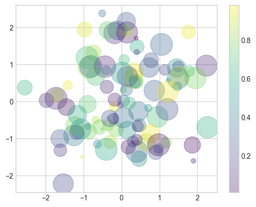
1
2
3
4
5
6
7
8
9
rng = np.random.RandomState(0)
x = rng.randn(100)
y = rng.randn(100)
colors = rng.rand(100)
sizes = 1000 * rng.rand(100)

plt.scatter(x, y, c=colors, s=sizes, alpha=0.3,
            cmap='viridis')
plt.colorbar();  # 색상 척도 표시 show color scale
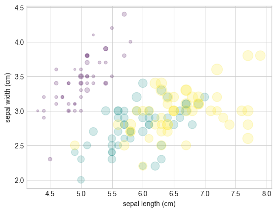
1
2
3
4
5
6
7
8
9
from sklearn.datasets import load_iris

iris = load_iris()
features = iris.data.T

plt.scatter(features[0], features[1], alpha=0.2,
            s=100 * features[3], c=iris.target, cmap='viridis')
plt.xlabel(iris.feature_names[0])
plt.ylabel(iris.feature_names[1]);
plot Versus scatter: A Note on Efficiency
데이터세트가 대량일 경우 plt.plot 이 plt.scatter보다 효율적
plt.scatter는 각 점에 대한 다양한 크기와 색상을 나타내는 능력이 있어 렌더러가 각 점을 개별적으로 구성하는 추가작업 필요
plt.plot은 점이 기본적으로 항상 서로 복제되어 점의 모양을 결정하는 작업이 전체 데이터 집합에 대해 한 번만 수행
Visualizing Errors
Basic Errorbars
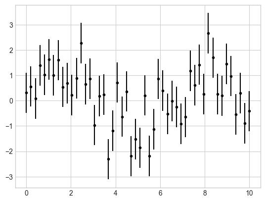
1
2
3
4
5
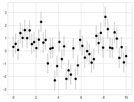
x = np.linspace(0, 10, 50)
dy = 0.8
y = np.sin(x) + dy * np.random.randn(50)
# fmt는 선과 점의 모양을 제어하는 포맷 코드
plt.errorbar(x, y, yerr=dy, fmt='.k');
1
2
3
# 오차 막대 맞춤 설정
plt.errorbar(x, y, yerr=dy, fmt='o', color='black',
             ecolor='lightgray', elinewidth=3, capsize=0);
Continuous Errors
1
2
3
4
5
6
7
8
9
10
11
12
13
14
15
from sklearn.gaussian_process import GaussianProcessRegressor
from sklearn.gaussian_process.kernels import RBF
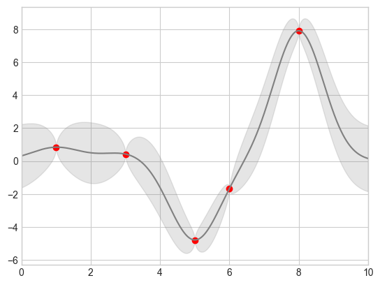
# 모델을 정의하고 일부 데이터를 그림 define the model and draw some data
model = lambda x: x * np.sin(x)
xdata = np.array([1, 3, 5, 6, 8])
ydata = model(xdata)
# 가우시안 프로세스 적합 계산 Compute the Gaussian process fit
gpr = GaussianProcessRegressor(kernel=RBF(), random_state=0)
gpr.fit(xdata[:, np.newaxis], ydata)
xfit = np.linspace(0, 10, 1000)
yfit, MSE = gpr.predict(xfit[:, np.newaxis], return_std=True)
dyfit = 2 * np.sqrt(MSE) # 2*sigma ~ 95% confidence region 신뢰 영역
1
2
3
4
5
6
7
# Visualize the result
plt.plot(xdata, ydata, 'or')
plt.plot(xfit, yfit, '-', color='gray')
# x값과 y의 하한값, y의 상한값을 순서대로 전달해 그 사이 영역이 채워진 결과 확보
plt.fill_between(xfit, yfit - dyfit, yfit + dyfit,
                 color='gray', alpha=0.2)
plt.xlim(0, 10);
이 기사는 저작권자의 CC BY-NC 4.0 라이센스를 따릅니다.