Simple_Line_Plots
Simple_Line_Plots
Simple_Line_Plots
1
2
3
4
5
6
%matplotlib
inline
import matplotlib.pyplot as plt

plt.style.use('seaborn-v0_8-whitegrid')
import numpy as np
1
2
3
4
# 그림 인스턴스
fig = plt.figure()
# 축 인스턴스
ax = plt.axes()

1
2
3
4
5
6
7
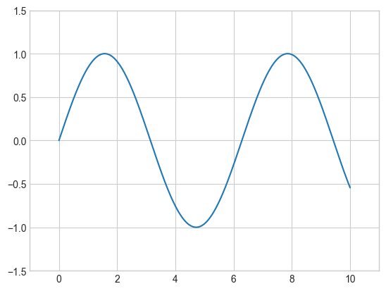
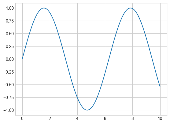
# 간단한 사인 곡선
fig = plt.figure()
ax = plt.axes()
x = np.linspace(0, 10, 1000)
# 데이터 플로팅, 세미콜론은 출력에서 플롯의 텍스트부분 숨김
ax.plot(x, np.sin(x));

1
2
# 객체지향 인터페이스를 이용한 간단한 사인 곡선
plt.plot(x, np.sin(x));

1
2
3
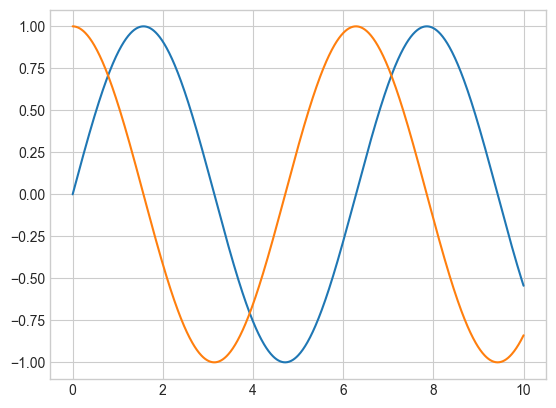
# 여러 줄 중복 플로팅
plt.plot(x, np.sin(x))
plt.plot(x, np.cos(x));
Adjusting the Plot: Line Colors and Styles
1
2
3
4
5
6
7
# 플롯 요소의 색상 제어
plt.plot(x, np.sin(x - 0), color='blue')  # 색상을 이름으로 지정 specify color by name
plt.plot(x, np.sin(x - 1), color='g')  # 짧은 색상 코드 short color code (rgbcmyk)
plt.plot(x, np.sin(x - 2), color='0.75')  # 0과 1 사이로 회색조 지정 Grayscale between 0 and 1
plt.plot(x, np.sin(x - 3), color='#FFDD44')  # 16진수 코드 Hex code (RRGGBB from 00 to FF)
plt.plot(x, np.sin(x - 4), color=(1.0, 0.2, 0.3))  # RGB tuple, values 0 to 1
plt.plot(x, np.sin(x - 5), color='chartreuse');  # 모든 HTML 색상 이름을 지원 all HTML color names supported

1
2
3
4
5
6
7
8
9
10
11
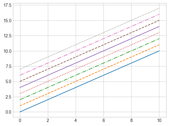
# 라인 스타일 제어
plt.plot(x, x + 0, linestyle='solid')
plt.plot(x, x + 1, linestyle='dashed')
plt.plot(x, x + 2, linestyle='dashdot')
plt.plot(x, x + 3, linestyle='dotted');
# 축약형 코드 For short, you can use the following codes:
plt.plot(x, x + 4, linestyle='-') # solid
plt.plot(x, x + 5, linestyle='--') # dashed
plt.plot(x, x + 6, linestyle='-.') # dashdot
plt.plot(x, x + 7, linestyle=':'); # dotted
1
2
3
4
5
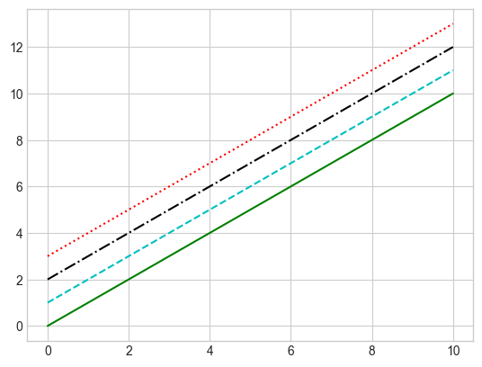
# 간단한 구문으로 색상과 스타일 제어
plt.plot(x, x + 0, '-g') # solid green
plt.plot(x, x + 1, '--c') # dashed cyan
plt.plot(x, x + 2, '-.k') # dashdot black
plt.plot(x, x + 3, ':r'); # dotted red
Adjusting the Plot: Axes Limits
1
2
3
4
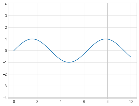
plt.plot(x, np.sin(x))
# 축 경계 조정
plt.xlim(-1, 11)
plt.ylim(-1.5, 1.5);
1
2
3
4
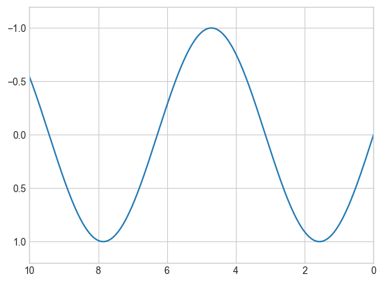
plt.plot(x, np.sin(x))
# 축 하나를 역으로 표시 --> 인수 순서를 바꿈
plt.xlim(10, 0)
plt.ylim(1.2, -1.2);
1
2
3
plt.plot(x, np.sin(x))
# 한 번의 호출로 x와 y축의 경계 설정
plt.axis([-1, 11, -1.5, 1.5]);

1
2
3
plt.plot(x, np.sin(x))
# 현재 플롯 주변 경계 밀착
plt.axis('tight');
1
2
3
plt.plot(x, np.sin(x))
# x와 y축 단위 통일
plt.axis('equal');
Labeling Plots
1
2
3
4
5
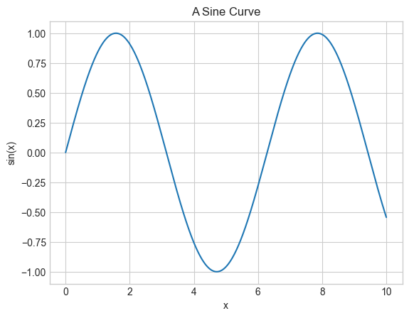
plt.plot(x, np.sin(x))
# 축 레이블과 제목
plt.title("A Sine Curve")
plt.xlabel("x")
plt.ylabel("sin(x)");
1
2
3
4
5
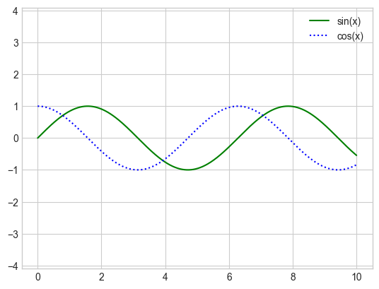
plt.plot(x, np.sin(x), '-g', label='sin(x)')
plt.plot(x, np.cos(x), ':b', label='cos(x)')
plt.axis('equal')
# 플롯 범례 생성
plt.legend();
Aside: Matplotlib Gotchas 주의사항
매트랩 스타일 함수와 객체지향 메서드 사이에서 전환
plt.xlabel()→ax.set_xlabel()plt.ylabel()→ax.set_ylabel()plt.xlim()→ax.set_xlim()plt.ylim()→ax.set_ylim()plt.title()→ax.set_title()
1
2
3
4
5
6
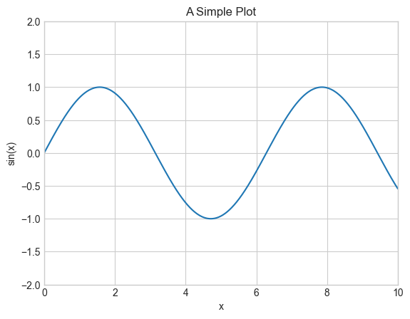
ax = plt.axes()
ax.plot(x, np.sin(x))
# 모든 속성을 한 번에 설정
ax.set(xlim=(0, 10), ylim=(-2, 2),
xlabel='x', ylabel='sin(x)',
title='A Simple Plot');
이 기사는 저작권자의 CC BY-NC 4.0 라이센스를 따릅니다.